How we use and interact with cyberspace has evolved significantly over the past decades, from slow dial-up connections to fiber optic speeds never thought possible. And now, we carry around high-speed pocket computers that let us connect from virtually anywhere. We’re now at a point where most connections to the internet are from mobile devices.
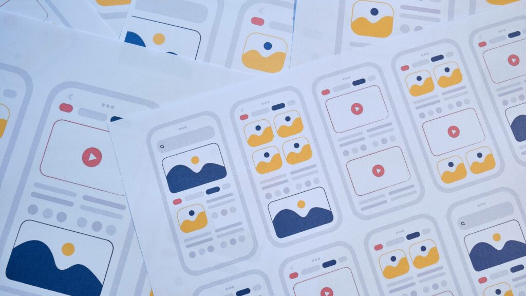
So, what does this mean for development and innovation going forward? Well, it means many things, but one of the main considerations is the focus on mobile app design. Creating functional and well-designed mobile apps is more vital than ever to ensure users are satisfied with their use.
Of course, just like any other type of development, certain mobile app design mistakes can be detrimental. Fortunately, these can be avoided! So, let’s take a closer look at the top 10 mobile app design mistakes to avoid during development.

10 Mobile App Design Mistakes to Avoid
1. Not Identifying the Target Audience of Mobile App Interface Design
One of the most vital first steps of mobile app interface design is identifying the target audience. After all, how can you create an app for a desired audience without knowing who they are and what they like? Designers need to consider that various demographics have differing preferences.
Overall, determining what demographics are part of the target audience allows designers to create an app that resonates with its primary audience. Here are a couple of factors to consider as part of the target audience design:
- Country/Ethnicity: The countries the app is used in can play a big role in design. Certain colors can have varying meanings in different parts of the world. Some layouts or navigation may not translate between different areas.
- Age: There is such a massive age range of users online these days, so it’s important to consider who will be using the app. Younger users may be more comfortable with complex features or lingo because of regular experience. However, older users may need simpler functions or navigation to effectively use the app.
2. Ignoring Accessibility in Mobile App UI Design
With the massive pool and range of users in cyberspace, it is important to consider accessibility for a large audience. There can be several design factors to think about as part of this. For instance, designing buttons large enough for anyone to use them or the option to increase their size. Additionally, consider:
- Color Choices: Color can be a roadblock for some people with varying types of color blindness. Designers can help with this by using contrasting colors to help them navigate or offering optional colorblind modes.
- Fonts and Typography: Let’s be real – some fonts and typography can be incredibly difficult to read. This can be handled by using simple or clear fonts, as well as offering options to adjust font size for easier readability.
- Text to Voice: For those with vision issues, it may be a good idea to integrate text-to-speech options or easier integration. Many devices come with this built-in, but apps can help by developing better integration with device functionality or their own audio options.
3. Overly Complex UX Architecture
When it comes to mobile apps, people want to be able to easily find what they are looking for and fast. A common pitfall is overly complex UX architecture that becomes burdensome to navigate or operate. This can quickly turn someone away from an app. So, be sure to consider the user’s journey and how to streamline it as much as possible.
4. Simple and Concise Copy
Any copy within the app should be clear, concise, and easy to understand. Overly complex paragraphs, improper writing, or walls of text can easily overwhelm or frustrate a user. There should also be places for the user to “rest” their eyes, such as page breaks or white space. The copy won’t primarily be on the app designer themself, but they should work with a professional UX writer for well-done copywriting.
5. Going Overboard on Design
A major mistake for some designers is going way too far overboard on design. They focus too much on making the most flashy or utilizing every bit of space for design. Sure, it can feel fun to “flex” your design skills with creative elements, but this can also overload the user. Overly complex or cluttered design can make it harder for users to have a good experience. Sometimes, simple is better.
6. Hooking the User with a Good First Impression
The first time a person opens the app is the most important time. This is where they will decide whether the app is worth continuing to use, which means the design needs to make a good impression.
So, how do you make a good first impression with an app? Well, this can vary, but there are several necessary elements for a good start, including:
- Easy navigation
- Fast-loading times and optimization
- Intuitive user experience
- A welcoming home screen
7. Ignoring Budget Constraints
While a budget can feel extremely constricting for some designs, it is vital to stick to the constraints. It is so easy for a poorly designed app to come from mismatched budget and design expectations or aspirations.
This can go both ways. Expectations or aspirations that are too high on a small budget can lead to half-baked and underdeveloped features. A high budget without proper direction or planning can lead to an overly complicated or bloated design.

8. Don’t Forget Beta Testing
Deadlines and crunch time can often lead to teams rushing to get things done. While these are a necessity in the world of business and development, this doesn’t mean testing is unnecessary. Even the most skilled designers can be under pressure, make mistakes, or miss something.
This is why beta testing any app with a smaller audience first is important before sending it to market. Beta testing can help to discover unknown issues or bugs that can range from annoying to catastrophic.
9. Notification Overload
We’ve all had to deal with the annoyance of too many notifications. An app that sends you thirty notifications throughout the day for insignificant reasons becomes a nuisance quickly. When deciding on what the app should notify, be sure to consider the user’s time and relevancy. Designers need to create a balance between engaging and annoying.
10. The Importance of Optimization
We briefly mentioned optimization earlier, but we’re going to reemphasize it here. The reality is that the modern age of speedy technology has introduced a level of instant gratification. Meaning, users want their apps to be snappy, responsive, and low on latency.
It can be easy to lose a user’s attention or interest when they are waiting too long for pages to load or for their input to register. Be sure to always prioritize optimization as part of development.
Ready to Build Your App?
We hope these mobile app design tips help you become a better designer than ever! If you’re looking to have an app designed and developed, you’ve come to the right place with Graphem Solutions. Our team consists of developers and designers with years of experience in the industry. They are ready to work with you to build the perfect app that blows your users away. Reach out today to get started!


