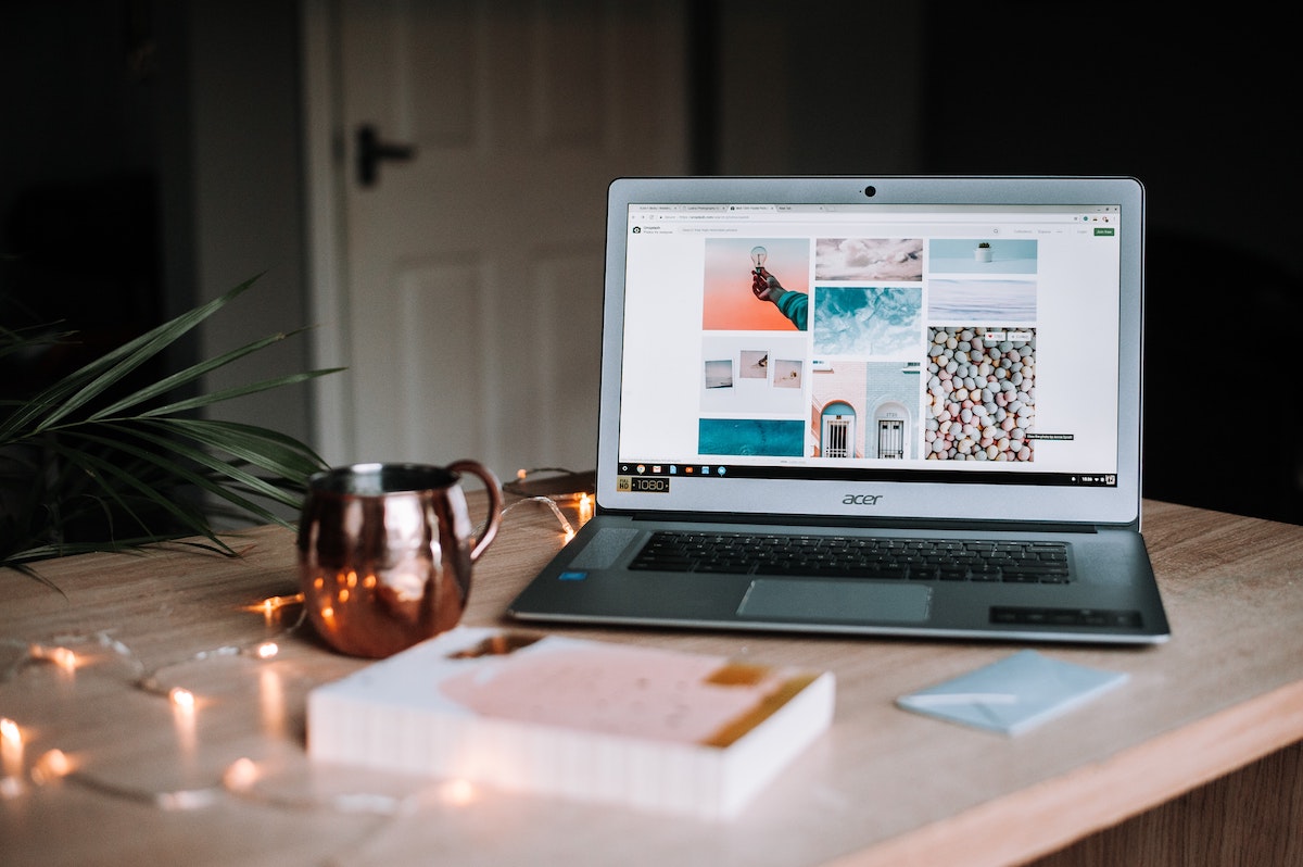
How do you capture and hold the attention of visitors to your website? You do it by having a professional and aesthetic design. This means great content and great photos.
We are living in a visual age. People will be more inclined to stay on your website and read your content or click on your pages if you have great photos.
The same applies to your social media platforms. Your followers or potential followers will stop first for an image that’s interesting and then read the content that goes with it. You literally have about a second to grab their attention when they log onto your website or while they are scrolling through their social media feed.
Speaking from experience, there are a few criteria to look for in a photo if you want it to stand out on your website or social media. Again this all depends on what kind of message you are trying to communicate, your brand and online presence.
Here are a few elements that we have found generally successful when choosing an image for a website or to use on social media.
//1. Bright Colors or Lighting
Bright lighting or colors – clothes, backgrounds or font – imposed against a contrasting background make for an alluring image. An example could be a black and white photo with a quirky bright neon font imposed over top. Or take a flat looking image and apply a filter to brighten the contrast up a few levels.
Just be careful not to go too overboard with the neon and to consider your particular brand or message when choosing an image. While something bright and flashy might work for a fashion website or a blogger or entrepreneur’s social media it probably won’t fare well for an accounting firm or medical clinic.
//2. Juxtaposition
Juxtaposition: the fact of two things being seen or placed close together with contrasting effect. (source: Oxford Languages)
Images where there is a clever use of juxtaposition always make for an interesting photo. Imagine one purple flower in a sea of yellow or white flowers. Or a black and white photo with one object or person colorized. Other ideas could be someone or something placed somewhere it doesn’t normally belong therefore creating an interesting contrast. Or two disrelated items put together. Just google juxtaposition to get more ideas.
//3. Bokeh
Wikipedia defines Bokeh as: In photography, bokeh is the aesthetic quality of the blur produced in out-of-focus parts of an image. Bokeh has also been defined as “the way the lens renders out-of-focus points of light”. Differences in lens aberrations and aperture shape cause very different bokeh effects. (source: Wikipedia)
Photos that focus on one object in the forefront and blur the background help guide your attention to a central subject. Bokeh photography is very aesthetic and appeals to the majority of viewers.
//4. Dramatic Lighting
We have found that when you choose a photo with dramatic lighting it gives a clean and professional look. This kind of image works especially well on websites showcasing clothing, home decor or people as the primary points of interest.
//5. Black and White
You can’t get more classic than a black and white photo. There’s just something impactful about a black & white or silver toned photo that makes it stand out. You can take a busy photo where the subject is lost and turn it into a clean piece of sparkling focus just by editing it into black & white.
These are just some of the aspects you can consider when choosing a photo for your website or social media. There is certainly a lot more information out there on this subject and a professional photographer would be beneficial to source out.
However, if you are looking for free high-quality stock photos right now we highly recommend Unsplash. Their photos are taken and submitted by users from all over the world. And the best part is they don’t look like those stilted stock photos you have to pay for! A few other noteworthy websites for free stock photos are pixabay, stockvault and pexels. Happy hunting!
Graphem Solutions is an award winning web design and development company. If you’re having trouble coming up with a strategy for your website and want to generate and convert more leads contact us. Take advantage of our FREE website analysis and 20 minute consultation. Talk to one of our web experts and get real advice on how to make your website work for you.


