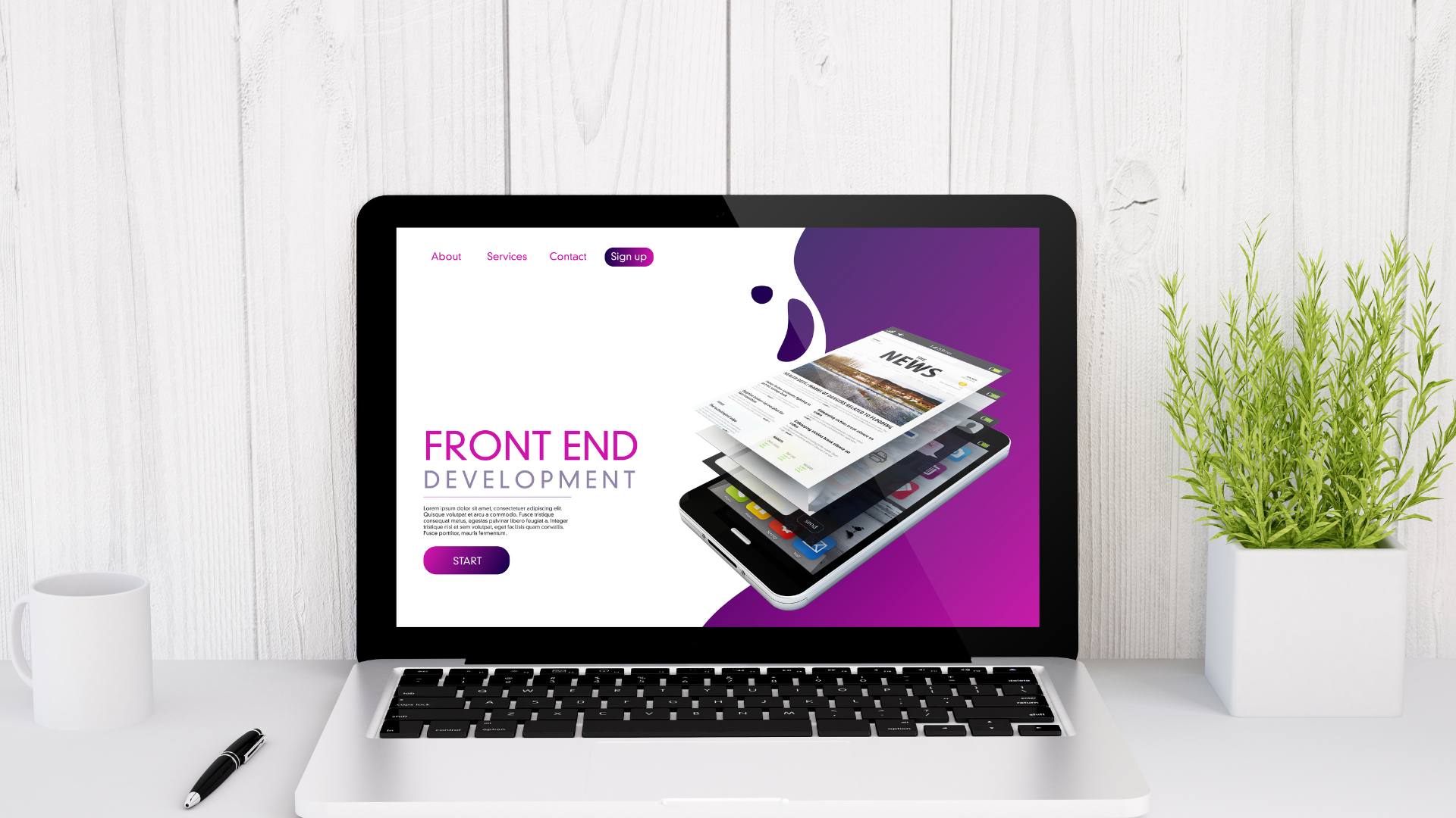
With over a decade of experience in web design, Graphem web designers have had plenty of learning opportunities. It’s only from practice and experience that knowledge can mature into web design wisdom. So, here are our top 10 tips for web design wisdom that come from our refined knowledge base.
5 Design Tips Every Web Designer Should Know
Before getting into the depths of web designer wisdom, here are some fundamentals to consider on the path ahead.
1. Accessibility and Clarity
A web page should be self-explanatory and help facilitate the client’s access to information. The more time spent dealing with an internal site interface, the less efficient it is. The less efficient it is, the more opportunities a customer has to evaluate these weaknesses and consider alternative options.
If the navigation and layout aren’t simple and intuitive, it begins to raise unnecessary questions and complicates the whole process. This leads to frustration and an overall decline in user satisfaction. This leads to a fairly fundamental and universal axiom: wherever possible, keep it simple.
2. The User’s Patience is a Valuable Resource
The only thing more important perhaps than a user’s time is their patience. This is why web designs should be easily accessible to draw people in and encourage them to explore further. This is the opportune moment to ask for registration or similar information if necessary. From here, users can invest their time and patience accordingly into navigating your site and seeing everything you have to offer.
3. Focus the User’s Attention
Since websites are a mix of static and dynamic elements, certain elements will naturally get the user’s attention over others. Wise web designers take advantage of the human eye’s non-linear ability to detect edges, patterns, and motion almost instantly. Using this will help get their attention focused where you want it to and create the best user experience possible.
4. Clearly Showcase Available Functions
Whatever functionality your website has should be as quickly and as easily accessible to users as possible. Many modern websites use large buttons and graphics to direct users to these functions. This is an effective solution, but not the only one available. What matters in solving this problem is users are comfortable with the functions and interacting with the site.
5. Write for the Web
The web is different from print media, and you can’t approach writing for the web in the same way. Users have different preferences and browsing habits when reading online. Avoid long blocks of text or exaggerated language whenever possible.
Ultimately, you want to keep things short, sweet, and efficient. Here are some general web writing tips and guidelines:
- Again, shortness and concise phasing are key.
- Keep the layout scannable (categorize content, use multiple headings and levels, alongside visual elements like bulleted lists to break the flow).
- Plain and effective language (“sign up!” is better than “our services” for example).
5 More Expert Tips from Web Design Company Professionals
As any web design company professionals know learning and development is a continuous ongoing process. Here are some more expert tips to elevate your web design further.
6. Keep It Simple
This axiom is true in many fields but holds especially true in web design. When designing a website, you should strive for simplicity over complexity. As mentioned above, users are interacting with the site to access information not to access the site itself. The fewer design complexities separating users from their desired information, the better.
7. White Space Can Be Useful
White space is almost like a void we strive to fill, but there is a certain value in those spaces. For starters, they control and mitigate the stream of information the user is getting. Not only that, it controls both what information is immediately viewable and when.
Complex structures can be harder to immediately read, scan, analyze, or digest. By breaking these structures down into hierarchies or separating them with white space, they become easier to read.
8. Use “Visible Language” to Effectively Communicate
Visible language is a way to think of and utilize page presentation for effective communication. There are three critical components to this.
- Organization: Present a clear and consistent conceptual structure. This will include features like screen layout, and consistencies in relationships and navigatability. Any organizational conventions and rules in one element should be applied to all of them.
- Economy: Do as much as you can with as little as possible. Aim for simplicity in design, clarity in function, distinctiveness in individual elements, and emphasis on the most important elements.
- Communication: The design needs to act as a means of communication. There needs to be a balance of factors like legibility, readability, typography, symbolism, viewpoint, and color or texture. Use a maximum of 3 typefaces in a maximum of 3-point sizes. Strive for around 18 words or 50-80 characters per line of text if at all possible.
9. Conventional Wisdom Is Wisdom for a Reason
Conventional wisdom is often the convention because it gets the best results. Design conventions are useful to reduce the amount of learning required and promote easier accessibility. This can mean relying on the successes of the past, from presentation, organization, or functionality in the current design.
This can help build users’ confidence and trust and promote a sense of reliability in their experience. Follow their conventional expectations for site navigation, text structure, or search placement to ease overall navigation.
Generally speaking, it’s best to innovate only when the innovation is an improvement over the original. Otherwise, rely on the strength of the wisdom of the past for the best results in the present.
10. Test Early, Test Often
Every web design project should be frequently tested at different stages of the process. Usability tests will spot problems early before they become more ingrained (or necessary to other aspects of the site’s operation). They’ll also help give insight into any potential problems or issues with a given layout.
You should think of this process as a series of refinements and improvements. Failure is not only acceptable in these instances but an opportunity to implement improvements. Besides, you’d rather be debugging problems like this before launch rather than on Day 1.

Get Personalized Web Design from Graphem Solutions
This is just the tip of the iceberg in terms of web design wisdom from Graphem. With over a decade of experience providing personalized web design services, our designers have learned all this and a whole lot more. Contact us today for more information or to get started!