Case Study
The Rhythm of Us
Services
- Web Design
- Web Development
- Email Marketing
Timeframe
- 3 months
Overview
Project Goals
The main goal of the project was to design and develop a custom Kajabi website that could:
- Highlight the client’s personal brand and showcase her services and products
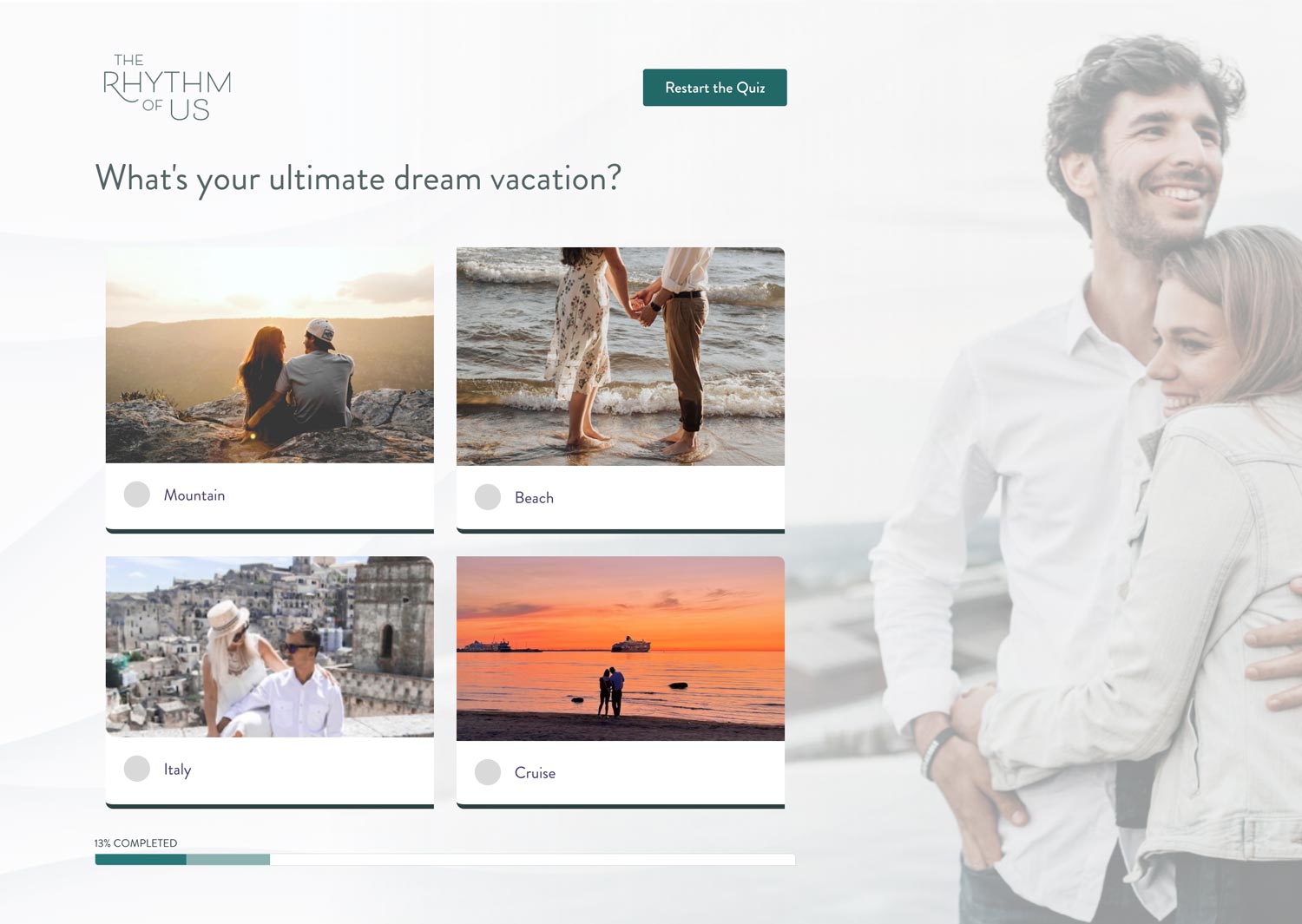
- Provide an interactive and user-friendly experience for visitors
- Create a separate quiz platform
- Be easily navigable, with a clear path to purchase or book coaching sessions
- Integrate with third-party tools, such as an email marketing system and social media platforms
- Integrate Shopify to sell physical product
- Be optimized for search engines and have a strong focus on conversion rates
Process
01/
Project Kick-Off
During the project kick-off, our team and The Rhythm of Us reviewed the project scope, objectives, and timeline.
02/
Design Development
The design team created a custom website design that aligned with the client’s brand and vision. They ensured that the website was visually appealing, easy to navigate, and optimized for conversions.
03/
Development
The development team implemented the custom design using Kajabi’s tools and functionality. They integrated platforms for email marketing systems, podcast platforms, and payment gateways.
04/
Testing Phase
05/
Launch
Design
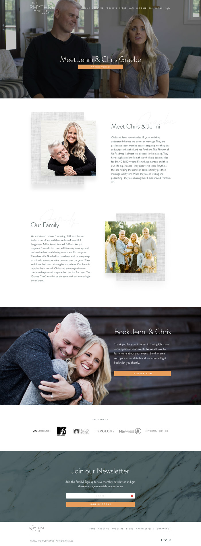
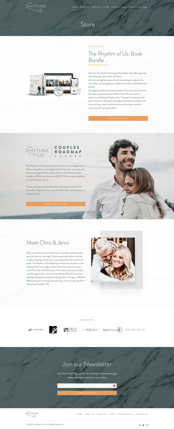
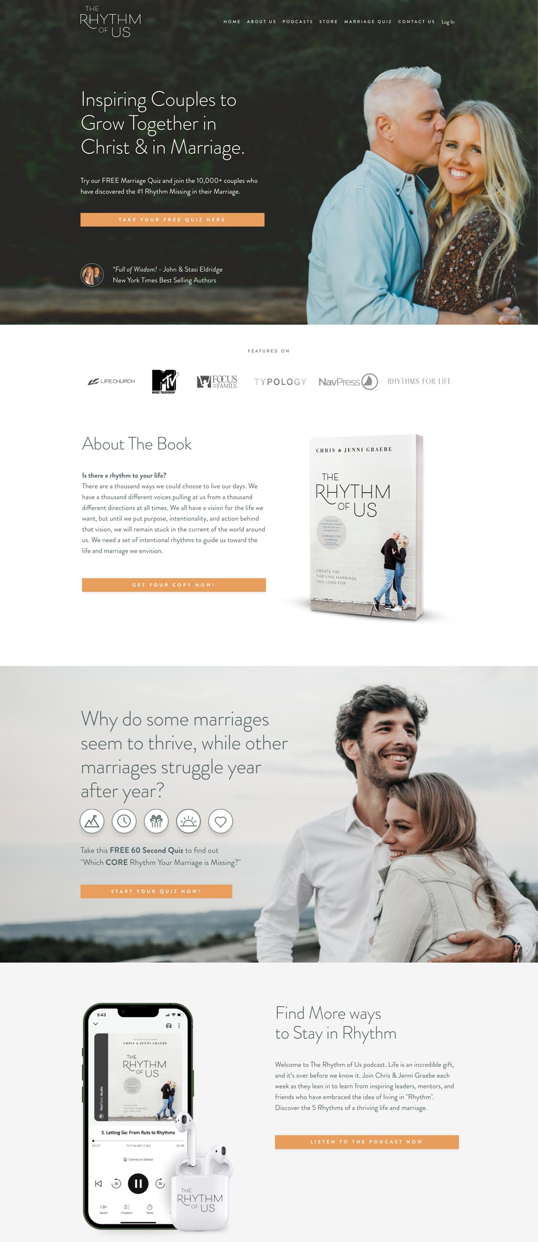
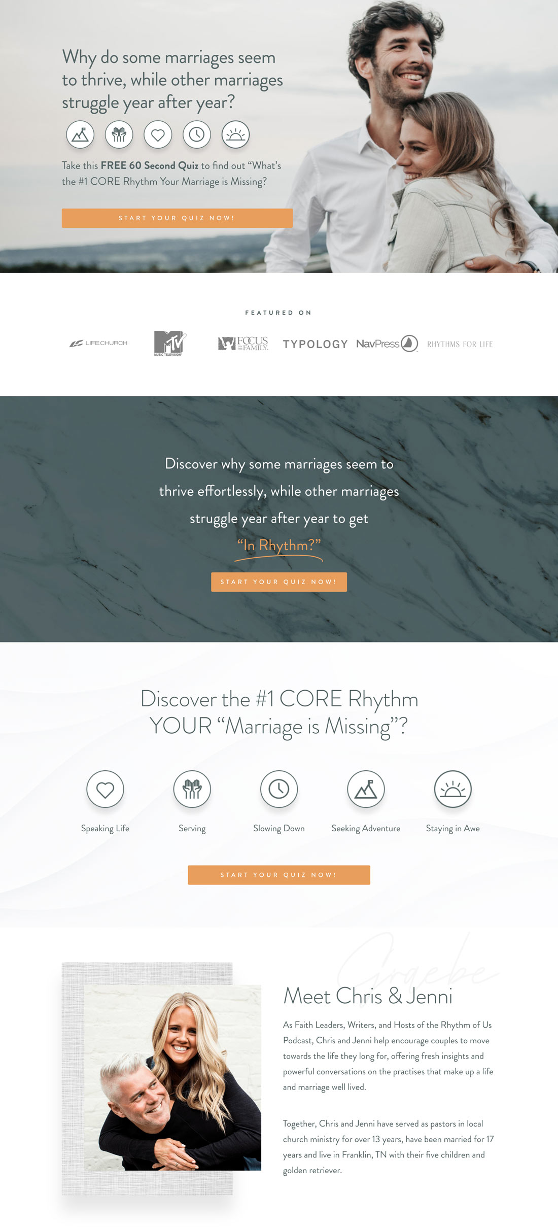
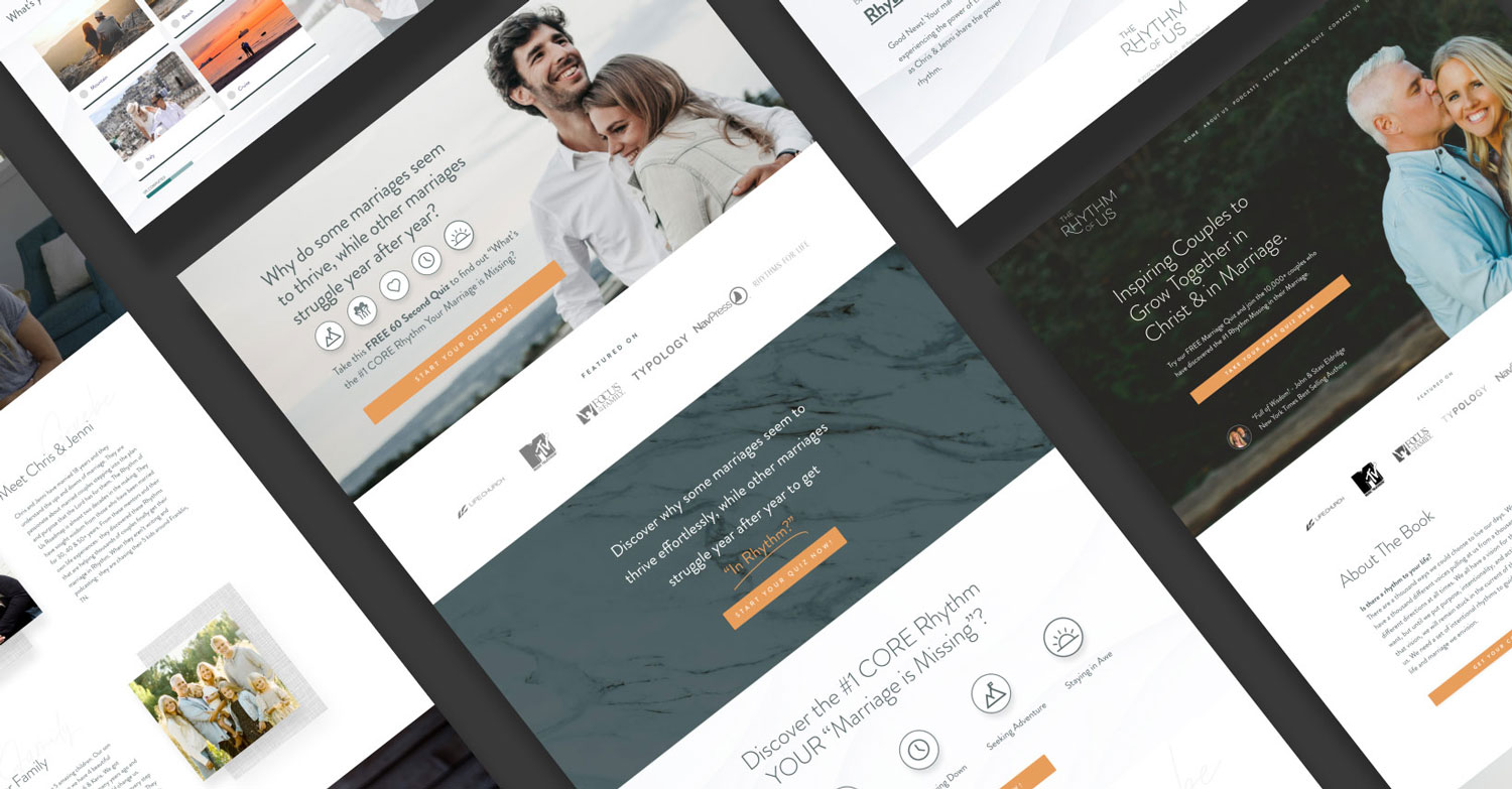
The website is well-designed with a professional and modern aesthetic. The use of a calming color palette of blues and greens, along with the use of whitespace, creates a clean and calming design. The typography is legible, with clear hierarchy and emphasis on the most important information. The use of parallax scrolling adds a dynamic effect, while not compromising the ease of navigation.
Overall, the design of the website is carefully thought-out and executed with attention to detail. The design aligns with the theme of the website, which focuses on mindfulness and wellness, and creates a pleasant and user-friendly experience.
Development
Outcome
The Kajabi website development project was a success, delivering a custom website that met the client’s requirements and provided an enhanced user experience for visitors. By leveraging Kajabi’s functionality and integrating with third-party tools, the website was able to drive traffic, increase lead conversions, and generate more revenue for the client.

