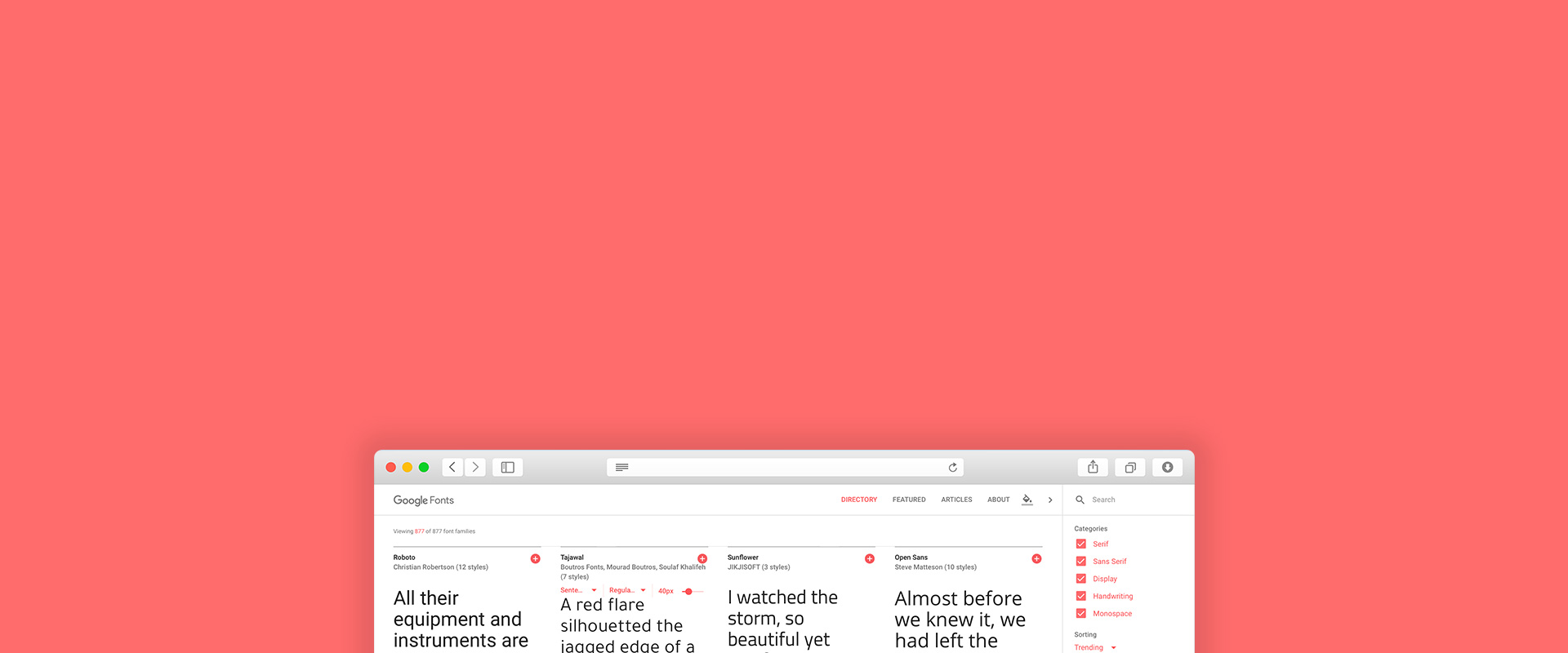
In designing headings for your work, there are some particular fonts in a font family that are more suited to that purpose than others. Here, we highlight five of the best from Google Fonts, each with its own particular attributes to contribute to your piece.
//01
Roboto Slab
Roboto font itself is a versatile font. But for headings, Roboto Slab is more suitable. It is tight and very well balanced. This one is an excellent choice for business or tech oriented websites.
//02
Montserrat
This sans-serif font has a width to height ratio that is almost equal, which makes it very profound. It has a large variety of styles, so you can use different variations to increase rendering speed. This font (especially when used in bold weights) looks good for corporate or portfolio sites.


//03
Lato
A universal sans-serif default font that is appropriate for almost anything. It works with any design, as it is sort of featureless and is available in a lot of styles.


//04
Catamaran
This font has a large quantity of styles and unique letter shapes, which makes it perfect for headings. This font is well suited for portfolios or arts websites.

//05
Raleway
This is one of the most readable web-fonts from the Google Fonts library. It is very well balanced, thanks to its carefully adjusted symbols.

These are certainly not all of the fonts that can be used for headings, but gives you a solid starting point for creating your own headings.